








Roll-on bottle packaging ideas: simple, elegant and artisan-made
How to give a small bottle a polished, premium look without overcomplicating the packaging.
The smaller the product, the more its packaging has to communicate. A 5 ml bottle can easily disappear on a shelf, yet the same bottle, presented with care, can feel like a small, precious object.
Square amber-glass roll-on bottles in 5 ml and 10 ml sizes are highly versatile for small-batch makers. Their compact format works well for samples, thoughtful gifts, pulse-point fragrance blends and limited mini collections. That same understated size, however, can work against the product when the packaging is not designed as a complete presentation.
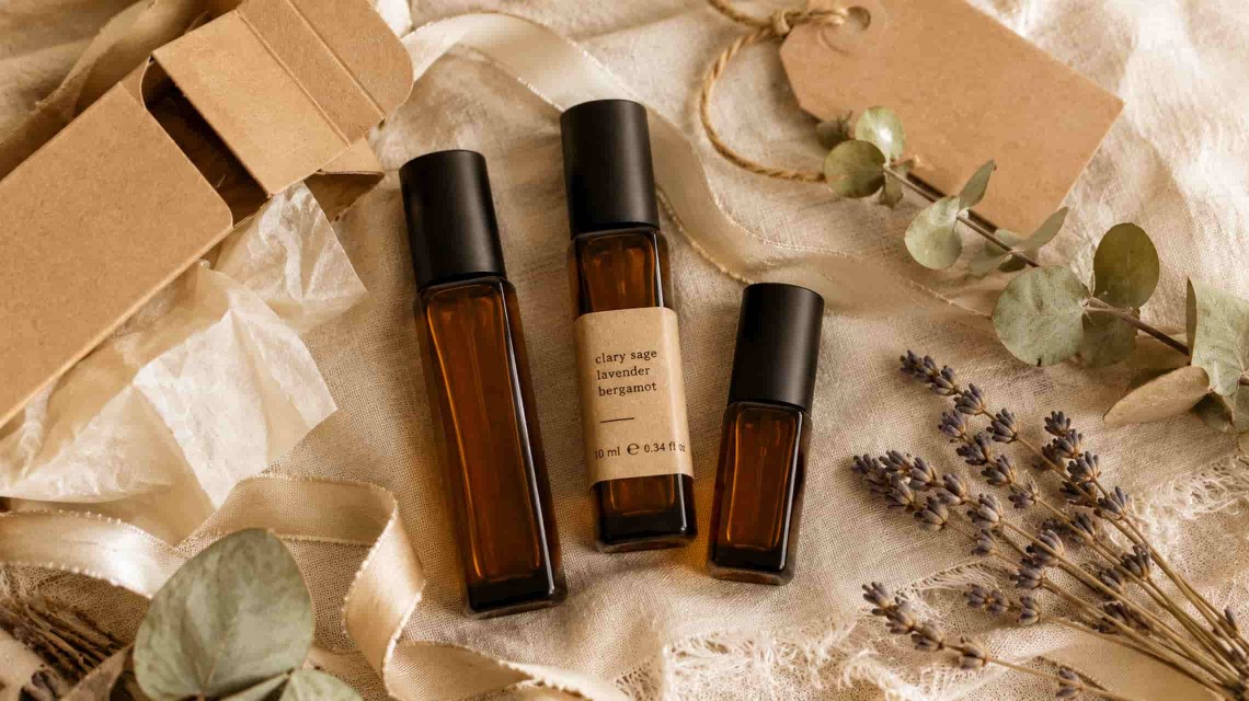
The good news is that an amber roll-on bottle already has a strong visual identity. The warm glass, square silhouette, matte black cap and metal roller ball provide an excellent foundation for premium presentation. The next step is simply to bring those features together in a coherent packaging system.
This guide explores three packaging directions — kraft minimalism, natural botanical and dark elegance — along with the elements that can turn a simple container into a confidently presented product. No jargon or inflated promises, just practical ideas that are easy to adapt to your brand.
The anatomy of premium roll-on packaging
Before choosing a style, it helps to understand the elements that can make up a complete roll-on package. Each has a distinct role, and leaving out an important component can affect how the finished product is perceived.
A square amber-glass roll-on bottle already has plenty of character. The tinted glass can help shield light-sensitive contents while giving the product a polished, professional appearance. Its square shape has a more graphic presence than a round bottle and sits neatly on flat surfaces, including in product photography.
The matte black cap creates a pleasing contrast with the warm amber glass. Together, the two elements form a balanced and recognisable silhouette. There is no need to add several glossy or brightly coloured details; amber and black can carry the product's visual identity on their own.
A self-adhesive kraft label can be applied to the bottle's flat face and may include the brand name, product name and a short message. It carries your visual identity directly on the container. A vertically oriented rectangular format naturally follows the bottle's proportions.
An elongated kraft box, selected to suit a 5 ml or 10 ml bottle, turns a small container into a gift-ready product. It adds protection during handling and creates a more satisfying opening moment. From the customer's perspective, a bottle presented in a well-chosen box can feel entirely different from the same bottle offered without secondary packaging.
A kraft tag tied to the bottle neck or box with jute twine adds an artisan touch. It can carry a handwritten product name, a short message or a decorative motif. It is optional, but it can move the presentation from simply tidy to personal and memorable.
A 1 cm satin ribbon tied around the box or bottle can complete the presentation and give it a gift-ready finish. Neutral shades such as cream, black or kraft brown maintain a coherent palette while adding a soft tactile detail.
A practical rule: When you are just starting, there is no need to invest in every component at once. Begin with the bottle, the label and one additional element — either a box or a tag. Those three pieces are enough to create a coherent presentation. Ribbon and other decorative accents can be introduced gradually as your visual style becomes more defined.
Style 1: Kraft minimalism
This is one of the most accessible starting points and also one of the most visually balanced. Kraft minimalism relies on the contrast between warm amber glass and natural paper texture, with no unnecessary elements or loud accents.
Elements of the minimalist style
- Square amber-glass roll-on bottle (5 ml or 10 ml) with a matte black cap
- Rectangular self-adhesive kraft label with minimal text — only the brand name and product name
- Plain elongated kraft box, optionally finished with a round logo sticker on the lid or one side
- Optional: a small kraft tag tied around the bottle neck with jute twine
What the finished presentation looks like
The finished presentation may combine an amber bottle with a kraft label, placed inside a simple kraft box and finished with a discreet logo sticker. The label uses a clean sans-serif or understated serif typeface with generous space around the wording. The palette stays limited to the natural tones of the materials.
The result feels clean, orderly and lightly influenced by Scandinavian design. It suits brands built around simplicity, authenticity and attention to essentials.
Best suited to: New brands testing the market, small production runs, premium samples and mini collections. Costs can remain controlled while the visual result still feels considered and persuasive.
Style 2: Natural botanical
More layered than the minimalist approach, the natural botanical style introduces a plant-based accent — a sprig of eucalyptus, a few stems of lavender or a dried leaf placed beside the bottle or tag. It works especially well in product photography and social content because it combines the container with warm, natural textures.
Elements of the natural botanical style
- Square amber-glass roll-on bottle with a matte black cap
- Kraft label with a subtle botanical design — a small leaf or branch illustration in the brand palette, paired with the product name
- Elongated kraft box with a small eucalyptus sprig or a few stems of dried lavender arranged neatly beside the tissue paper
- Kraft tag with jute twine, finished with a small dried leaf or a discreetly attached pressed flower
- Slim 1 cm satin ribbon in a neutral shade — kraft brown, cream or sage green — tied around the box
What the finished presentation looks like
When opened, the box reveals the amber bottle nestled in tissue paper and finished with a botanical accent. The combination of paper, glass and plant details creates an appealing visual and tactile experience, while aromatic botanicals may add a subtle natural scent.
The result suggests a product with a story, prepared with care and rooted in an artisan-studio aesthetic. It is also a presentation style that translates naturally into customer photos and social-media content.
Best suited to: Nature-led artisan brands, gifts for special occasions, seasonal releases — especially autumn and winter — and gift sets containing several roll-on bottles.
Style 3: Dark elegance
The most sophisticated of the three directions, dark elegance shifts the focus from natural kraft tones to black, deep shades and metallic details. It suits brands seeking a premium position and a carefully controlled visual identity.
Elements of the dark elegance style
- Square amber-glass roll-on bottle with a matte black cap — enhanced by a darker surrounding palette
- Black or dark kraft label with gold, silver or white lettering — a strong, clearly defined contrast
- Elongated kraft box in a deep shade or with a black exterior, lined with black or rich cream tissue paper
- Matte black cardstock tag with natural jute or black cord — a contrast between rustic texture and refined colour
- A 1 cm satin ribbon in deep black or warm cream — a finishing detail that completes the presentation
- Optional: a black or burgundy wax seal applied to the thank-you card or inner tissue paper
What the finished presentation looks like
When the box is opened, the amber bottle stands out against black tissue paper or dark kraft. The contrast between warm amber and matte black is bold but balanced. Every element carries clear visual weight, allowing the whole presentation to suggest a limited edition without stating it on the label.
The result feels distinctly boutique, with a strong visual presence. It photographs well against white backgrounds or textured surfaces and can support premium positioning through the quality of the presentation itself.
Best suited to: Limited editions, special collections, corporate gifts, premium multi-scent sets and products positioned above the mainstream through presentation quality.
Small details that make a big difference
The smaller the bottle, the more important the finishing details become. These are the elements that help roll-on packaging feel tidy, coherent and easy to remember.
-
1A properly applied label — straight and bubble-freeOn a 5 ml bottle, even a 2 mm misalignment can be noticeable and affect the entire presentation. Work on a flat surface and smooth the label with a rigid card or application squeegee to remove air bubbles. This simple detail separates a carefully finished handmade product from one that looks improvised.
-
2Consistent tag-string lengthWhen preparing several bottles from the same collection, cut every piece of jute twine to the same length. Large differences between tags become obvious in product photography and can make the collection feel inconsistent. A ruler and scissors are enough to establish a repeatable standard.
-
3Tissue paper arranged neatly, not crumpledInside the elongated box, tissue paper should support and surround the bottle neatly rather than being pushed in at random. When the box is opened, it should look intentionally arranged, even when the process only takes a few seconds.
-
4A straight, symmetrical ribbon bowA carelessly tied ribbon can undermine an otherwise polished package. Use a simple, repeatable technique — a straight knot followed by a bow with even loops — and practise until the result becomes consistent. A 1 cm satin ribbon is structured enough to hold its shape during handling.
Do not underestimate a detail that never appears in the main product photograph. The inside of the kraft box, the reverse of a tag or the back of a card can hold a small surprise: a brief message, a decorative motif or a handwritten thank-you. Photography attracts attention, while thoughtful details discovered during unboxing can help build customer loyalty.
Cards and messages included with the product
A thank-you card or a concise instruction card can be especially useful with a roll-on product. The bottle is compact and likely to be handled often, while a handwritten message adds a personal note to the overall experience.
Packaging as a system, not an afterthought
When preparing roll-on products for sale, treat the packaging as a system made up of the container, label, protection and decorative detail. These elements work together, and the absence of an important component may be felt even when the customer cannot identify exactly what is missing.
You do not have to commit permanently to a single style. Many artisan makers use two directions in parallel — kraft minimalism for the core range and dark elegance for limited editions or seasonal gifts, for example. Coherence is not absolute uniformity; it comes from consistency and intention behind every choice.
The square amber roll-on bottle, black cap, kraft label, elongated box, string tag and satin ribbon are the building blocks of your own visual language. The right combination depends on your brand, your audience and the story you want the product to communicate when the package is opened.
A small product packaged with intention gains presence. A small product packaged carelessly remains just a bottle.
Build your own roll-on packaging system
At Solideea, you can find 5 ml and 10 ml amber-glass roll-on bottles, elongated kraft boxes, self-adhesive kraft labels, tags with jute twine and 1 cm satin ribbon — the elements you need to create a coherent presentation for handmade products.
Explore the Solideea roll-on collection →
Leave a Comment